Have you ever listened to the news reporting the latest study about how dreadful things have become or what the latest item likely to kill you is and found yourself thinking how can that be true?
Did you ever then consider the elements behind the report? Or did you, like the journalists and talk show hosts, wonder how it’s all come to this?
I think it’s time we all started thinking more critically about numbers and rocking the right ones! Whether it’s numbers in the news, or, more importantly, numbers in the reports you’re looking at in another window right now, have a second thought about them and see what you think.
Here are some of my favourite examples of statistics that can be misleading without any context:
Are our children really this uneducated about Christmas? Or was it a comedy multiple choice?
Less than half of very few women agree, is that enough to convince you?
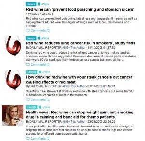
Either we should all be drip fed red wine, or the Daily Mail has an affiliate scheme with a wine provider!
This one may not have been reported in the papers but it is flawed! Thanks for the laughs Anchorman.
And let’s take a closer look at one particular example.
It has to be noted that tabloid press has probably paid a large part in the fear mongering from misunderstood and out of content statistics.
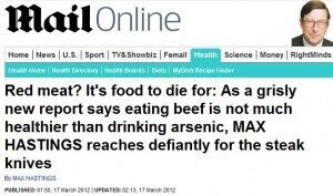
This example states that eating beef is ‘not much healthier than drinking arsenic’.
Say that again?
Beef = arsenic (a poison!)
Here’s how:
“Harvard Medical School has studied the dietary habits of 120,000 people over 30 years. Its researchers conclude that those who tuck into big steaks, rare lamb and, worse still, processed meats such as sausages and hamburgers, dramatically increase their prospects of contracting cancer or heart disease.”
Now watch the world’s media run with this and ruin the beef farming industry and all our Sunday lunches…
But wait!
The next day I heard a news report on the radio by the BBC (who also ran a story on the statistics, albeit much less dramatically), who wanted to clarify that the research was done in the US where beef portions are bigger. Ok, they might stop us Brits worrying by planting a picture of massive beef burgers and steak in our heads and comparing this to our Sunday Roast, but this doesn’t really disprove anything, other than the fact that even the BBC conform to stereotypes.
As it was the radio they didn’t have time to explain everything but they did however, explain themselves further with this article which looks at the details more closely and concludes that:
“The person who eats more meat is expected to live one year less than the person who doesn’t eat so much meat”
So much for beef being like arsenic! Thanks Daily Mail…
Enough about meat, how can you improve your numbers? I like to make sure I understand the following three things before using any provided statistic:
• Accuracy • Authority
• Argument
Accuracy – think about how much data was used to draw the conclusions, 90% of ten is not as conclusive as 90% of a hundred. The more data you can use to draw a conclusion the more accurate it will be, this is particularly important when split testing.
Authority – who is represented in the data and who put the data together, would any of them be biased in any way or was it a true representation? Most often in SEO we take our data from sources like Google Analytics which aren’t really the greatest authority.
Argument – what is the reason for the data? Is it trying to prove one side of an argument or could it be used to prove the other side too? Is it likely the numbers have been looked at with a biased view? And mainly, what can you do with the data?
So now that we know what to look for in numbers you can start thinking about how to improve reporting and use this to improve your results. Let’s take a look at organic keywords.
Rather than reporting on, for example, how many visits each keyword has brought to your site, compare this with other statistics that give a bigger picture to each keyword and help you understand the true value of each so that you know which ones are your most valuable targets.

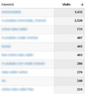
This data (pictured), shows us which keywords have led to the most visits but shows us little else.
One simple improvement is to use a date comparison so that you know how things have changed and where to focus next.
To gain a much more significant insight in to which keywords are working for your website, create a custom report to analyse how good each keywords is for you by looking at how the visitors they generate interact with the site and how well they convert.
Get your own custom report that shows interaction and conversions for organic keywords here.
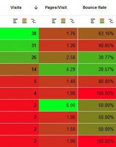
To help see what the numbers mean, I recommend using this Chrome Extension, Table Booster for Google Analytics that can add a colour scale to each column:
Unfortunately, by using any web analytics platform you are limited to a certain level of accuracy. The new sampling method in Google Analytics has an even lower of accuracy due to the results it uses in each sample in order to ‘speed up load times’. Don’t get me started on what Google have been doing with Analytics data recently!
The best way to get accurate Google Analytics data when the interface adds sampling is to use the API data export tool. An easy way to implement this is to use SEO Tools for Excel or Excellent Analytics which both pull un-sampled data from Google Analytics in to a spreadsheet where you can then manipulate the data to your heart’s content.
There are plenty of other ways to improve data, but the main point is to think critically about it so that you can make the most of it and get the best results from your website. Working with the right data is always the best route forwards, but if all else fails, you could always turn to the red wine – apparently it’s good for every health condition you might ever have!


